You Are Where You Eat

There are two different types of restaurants in New York, there is the one kind where you don't care where it is or what it looks like because the food is unbelievably good and the other is where you go to see and be seen. The Waverly Inn is of the latter type. I usually don't care about all that stuff but this winter I made an exception and it was worth it.

There is no listed phone number for The Waverly Inn (they dropped the Ye when Graydon Carter bought it) but lucky for me, I have friends in the know, so it was no problem finding the number and securing a reservation. Of course, once there we were seated in Siberia but who cares when you can still name drop that you've been there which is what my friend Matt has enjoyed doing on many occasions. Gotta love it. On the night we were there, we saw Calvin Klein, which was even funnier since we had seen him at a restaurant in Prague over Thanksgiving. Anne Hathaway also stopped in with her cute boyfriend. Even Spencer Morgan from The New York Observer was there that night scoping out the place for a story he was writing for his column.

The food sadly to say was just okay. They were out of a lot of dishes but luckily the amazing melt in your mouth biscuits made up for it! We raved about them for days so I was excited to see the recipe for them published in the May 2007 issue of GQ. Notice how it was a men's magazine that printed it, women don't eat carbs you know, but if you are going to break your diet, these are definitely worth it! Bon appétit!

Waverly Inn Biscuits

4 cups all-purpose flour, sifted
1 tablespoon salt
¼ tablespoon baking soda
3 tablespoons baking powder
½ teaspoon sugar
½ pound very cold unsalted butter
1 pint very cold buttermilk
2 eggs (for egg wash)

Directions
The easiest way to make these biscuits is with a KitchenAid-style mixer, for which these instructions are intended. If you don’t have one, you can use a large mixing bowl and a manual pastry cutter to incorporate the butter into the flour.

1. Combine dry ingredients in mixing bowl.

2. Dice butter into small cubes.

3. Toss some flour onto butter cubes (so they won’t stick together) and then add them to the bowl of dry ingredients. Using the paddle attachment on the mixer, blend the butter and flour mixture at medium speed for 2 to 3 minutes, until the bits of butter are the size of peas.

4. With the paddle still churning, add buttermilk. It will take about 20 seconds to incorporate. The mixture will be fairly wet and will resemble chocolate chip cookie dough.

5. Turn out dough onto a well-floured cutting board or counter top. Sprinkle more flour on top of dough. Using your fingers, gently fold dough over itself a few times and flatten it a bit. It should be lumpy and a bit loose, not cohesive and smooth like bread dough. Sprinkle the cutting surface with more flour if you think dough might stick.

6. Using a heavy rolling pin dusted with flour, gently roll out dough into a broad oval, about ½ to ¾ of an inch thick. Don’t overwork dough.

7. Using a cookie cutter or other straightedge, cut dough into biscuits. Don’t worry, they don’t need to be perfectly shaped. Gently place each biscuit on a baking tray. Cover with plastic wrap and refrigerate until ready to bake.

8. Preheat oven to 375 degrees. Remove biscuits from the fridge. Beat eggs and brush the top of each biscuit for about 7 minutes, until nicely browned and fragrant.

9. Serve immediately with butter, jam, or honey. Try to save room for the rest of your meal. Makes eighteen.

The Domino Book of Decorating


Just in case there is anyone out there who didn't get the lovely announcement email from Domino today regarding their upcoming book release, I'm posting the press release here. I'd say it's pretty exciting news and I know I look forward to it's publication! I just wonder who will make the cover!

"Domino, the hip magazine about stylish living that has become one of Condé Nast’s most successful launches of all time, has signed a deal with Simon & Schuster to publish its first book, it was announced today. Entitled The Domino Book of Decorating, the book is being edited by Domino Editor in Chief Deborah Needleman, Creative Director Sara Ruffin Costello and Style Director Dara Caponigro. It is being packaged by the firm Melcher Media, which also produced the hugely successful Lucky Shopping Manual, from sister Condé Nast publication Lucky Magazine. Simon & Schuster will publish in Fall 2008."

"The Domino Book of Decorating will feature the magazine's signature blend of beauty and comfort, glamour and practicality, and offer inspiration and advice for decorating every room of the home. Filled with floor plans, before-and-after shots, and a wealth of lush photography, it will include all of the magazine's popular elements: unexpected expert decorating tips, eclectic style juxtapositions, shrewd shopping strategies, and ideas drawn from sources as far apart as Louis XIV and Le Corbusier."

Needleman commented, “We’re creating The Domino Book of Decorating for a new generation of homeowners and renters, and hope to make it the new décor bible--a source of guidance, inspiration, and excitement.”

Sue Hostetler's Hip New York Home

I have to admit that I don't usually read Metropolitan Home. I flip through it but then decide that it's boring and put it back on the rack but I might just have to start after the feature I just found on Sue Hostetler. Although, to be honest I stumbled upon it on that weird Point Click Home site while looking for a photo from ELLE Decor.

For those of you who don't know, Sue Hostetler is the author behind the fabulous book Hip Hollywood Homes. If you haven't seen it, you have to pick it up. It's really great. I didn't realize she lived in New York though, so it was exciting to see inside the Soho loft she shares with her husband. It's clean and modern but not cold or stark with 14-foot ceilings and towering windows. I really love it and the decorator behind it, Valerie Pasquiou. Of course, what I really love is all that space. I'm so jealous! To read the entire article online, click here.

The office is the photo I saw and it really drew me in. I'm a sucker for a gallery wall and I think it's nice to have a space you can close off from the rest of the loft, especially to work.

The daybed in the living room is by the famed French designer Jean Prouve, and was upholstered in Ultrasuede. The acadia wood Poof side table/stool is by Tucker Robbins.

In the "open study" a painting by Ross Neher hangs above a Lucite console and custom ottomans. The marble topped bronze table is from Blackman Cruz.

I love the metal metal vanities and steel framed doors in the master bathroom. They look exactly like something you'd fins in a hip New York restaurant like Pastis. I think it's also nice to have a warmer bedroom sanctuary in a modern and mostly white home. But this white home is definitely not a boring white box. It was fun to peak inside this chic abode and if Sue Hostetler ever decides to write Hip New York Homes, she should definitely include her own!

Photographed by Antoine Bootz

I Heart Bryan Ferry

I mentioned previously that I love to read men's magazines. They always seem to have very intelligent and interesting articles, especially about art and architecture. So of course I had to pick up the fabulous 50th Anniversary issue of GQ this week. They have a few different covers featuring stylish men so I chose the Paul Newman cover, that was only because they didn't have a Steve McQueen cover. I'd like to know what's up with that!

Anyway, in the feature on the 50 Most Stylish Men of the Past 50 Years, I found the most handsome photo of rocker Bryan Ferry standing in front of the prettiest handpainted Chinoiserie wallpaper. He also happened to have been quoted as saying the following, "Other bands wanted to wreck hotel rooms, Roxy Music wanted to redecorate them." How chic is that!

I have no doubt now that Jerry Hall should never have left Bryan Ferry for Mick Jagger. If she hadn't, she would probably still be married and living in the most beautifully decorated homes ever! Sigh. I think I'm going to go fill out an application for Soho House right now so I can go meet some potentially non-gay British rock stars/decorators! Cheers!

Photo by Mick Rock

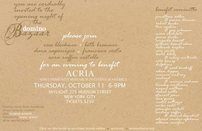
Domino Bazaar to Benefit ACRIA

I wasn't going to mention the Domino Bazaar since Style Court already did a great job posting about it but then this past Tuesday night after a reception at Phillips du Pury, I met a wonderful gentleman who happens to be a fundraiser for ACRIA, the AIDS Community Research Initiative of America. The opening night of the Domino Bazaar benefits ACRIA. It is a very worthwhile cause so I promised him I would also write about it in order to persuade you all to buy a ticket to the event and tell you about all the original artwork donated by major artist for sale at special prices! It will definitely be a fun night and it's tax deductible so what could be better than that?!

Domino Bazaar Opening Night Preview - join us on October 11th at Skylight Studios 275 Hudson Street (at Spring) New York, NY from 6-9pm for a spectacular evening when ACRIA and Condé Nast/domino Magazine Present fabulous cocktails and hors d'oeuvres and incredible design stations curated by domino. The ACRIA gallery at this four-day long event will feature new editions and unique multi-piece donations from Ross Bleckner, Jack Pierson, Jeff Lewis, Christo and Jeanne Claude and many more unique works by major contemporary artists. An exclusive Opening Night silent auction will include works by Keith Haring, Robert Rauschenberg, Bernar Venet, Donald Baechler and many more. Tickets are $250 and can be purchased at www.acria.org or by calling 212-924-3934 x101.

Stalking Albert Hadley

I thought you might all get a kick out of this photo I took the other day to send to Patricia Gray, the fabulous Canadian interior designer who has a major crush on Albert Hadley. I've joked with her in the past about how I see him standing outside his office every morning smoking his signature Camel cigarettes and that I was going to take a photo of him for her and this week, I finally did it. My only advice to other would-be stalkers out there is that you should never wear your most wildly patterned and colorful dress while you are trying to covertly take someone's photo. If you look really closely, I definitely think Mr. Hadley has spotted the crazy girl across the street taking his photo. Should make for an interesting story when I do finally interview him. But it was worth it to make Patricia smile and I hope it makes you smile today too!

Habitually Chic Interview


Franki over at Life in a Venti Cup was sweet enough to interview me recently for her lovely blog and today she has posted it! Very exciting if I do say so myself! She asked some very thoughtful and interesting questions that were really fun to answer. Unfortunately, I'm not tech savvy enough to figure out how to post a photo of it so I hope you'll head on over to her wonderful site, Life in a Venti Cup, where "life is too short to think small!" I hope you all enjoy it and thanks again to Franki for thinking I was interesting enough to interview in the first place!

***UPDATE***
I now have a wonderful photo of my interview over at Life in a Venti Cup courtsey of Jo at Desire to Inspire! Wasn't that so sweet!!! I spent at least a half hour this morning trying to figure out how to post it until I finally gave up! That's why I love my new blogger friends. They look out for you and come to your rescue when you need a little help. Thanks Jo!!!

Chic at Sotheby's

We buy a lot of things from auctions for our clients so I'm often perusing the catalogs. Even if you don't buy anything, I think they are a great resource for design ideas and a reference for custom pieces. There's a great photo of Kelly Wearstler from her book Domicilium Decoratus of her lying around reading auction catalogs. I get the feeling she's a serious buyer.

Anyway, the point of my post is that while flipping through the 20th Century Decorative Arts Selected by Gordon Watson sale catalog for the Sotheby's auction tomorrow in London, I came across the screen above designed by Robert Crowder. I'm more of a modern kind of girl but for some reason I really love this screen and technically, it is modern since it was made in the 1960's. The description from the catalog is pretty interesting too.

"Crowder, an American, first visited Japan in 1934. The trip began a lifelong love affair with the country and its art. His training with the great painters Shunko Mochizuki and Shimamoto-sensei served him well after his repatriation to the United States in 1943. After a brief stay in Chicago, Crowder moved west, opening a gallery in Los Angeles in the neighbourhood of Greta Garbo and other Hollywood legends. He quickly became famous for his screens and fabulous textiles, which as recently as 2005 were ordered for an international redecoration of the Chanel boutiques."

In a continuation of the story, the expansion and redesign of the Chanel boutique by Peter Marino won an AIA Institute Honor Award for Interior Architecture in 2005. The only photos I can find are very modern so I have no idea what they did with the screens and textiles mentioned in the catalog but I still think it's interesting. So the moral of this story is, check out an auction catalog, you never know what you might find!

Chic Inspiration

This is a multi-faceted post. One that yet again illustrates the close connection between fashion, art and design, and in this particular instance, perfume.

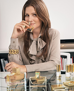
I'd been hearing a lot about the new scent that Aerin Lauder created for the Estee Lauder company called Private Collection Tuberose Gardenia. It's based on a private collection perfume that her grandmother, Estee Lauder, created in 1973 for herself. The part of the story that is so interesting is that the bottle for the new perfume is based on a Joseph Hoffmann brooch found in the Neue Galerie, a museum founded by Aerin's father Ronald Lauder and dedicated to early-20th century German and Austrian art.

Above is the modern interpretation of the brooch in gold and encrusted with stones while below, the original Josef Hoffmann brooch made in Vienna in 1904 is made of silver, partial gilt, diamonds, moonstones, opal, lapis lazuli, coral, leopardite. I think it's really interesting to see them together and see how the bottle design was influenced by the vintage piece and the fact that inspiration can be found anywhere!

If you've never been to the Neue Gallerie, you really should plan a visit. It's a small little jewel box of a place with a fabulous restaurant, Cafe Sabarsky, named after the museum's co-founder Serge Sabarsky, that serves authentic Viennese specialties. It's a great place to enjoy a hot chocolate on a cold New York afternoon. The Neue Galerie (New Gallery) also has a Gustav Klimt exhibit opening on October 18th. Check it out and enjoy some beautiful art and maybe a little strudel.

The Golden Age of Couture

Fall is the best time of year for many reasons, one of them being all the new museum exhibitions that are opening. I hope to write about many of them in the coming weeks but I thought I would begin with one spectacular exhibition first, The Golden Age of Couture: Paris and London 1947 - 1957, which just opening this past weekend at the Victoria and Albert Museum in London and runs through January 6, 2008.

"The launch of Christian Dior's New Look in 1947 marked the beginning of a momentous decade in fashion history, one that Dior himself called the 'golden age'. Celebrating the end of war and the birth of a new era, it set a standard for dressmaking and high fashion that has rarely been surpassed."

"In Paris, couture houses such as Balenciaga, Balmain and Fath attracted worldwide attention for elegance and glamour. London was renowned for formal state gowns by court dressmakers and impeccable tailoring by designers like Hardy Amies."

"The production of couture was important to the prestige and economy of both France and Britain. While traditionally catering for wealthy private clients, the couture houses also sought new markets. As the decade progressed, they created perfumes, opened boutiques and licensed their designs to foreign manufacturers. By the late 1950s, the leading couture houses had become global brands."

For those of you who can't make it to the exhibit, the V&A has a great catalog and the website has some wonderful highlights from the show including the 'Bar" suit from Christian Dior seen above, one of Dior's most important designs from his first collection, and also a page from his notebook below. You can also enter a shoe design contest and create your own couture inspired creation from a pattern provided. Pretty exciting stuff! The V&A is definitely giving the Met's Costume Institute a run for it's money!

I Heart Assouline

I love books! As does everyone in the blog world it seems, which is why I thought I'd take a moment to profile one of the chicest luxury publishers ever, Assouline. It's surprising that the company was only created by Proper Assouline about ten years ago. For some reason, it seems like they have been around forever! As one person said it best, "As Cartier is to watches, Assouline is to books."

Not only are their books chic, but so is their Paris boutique on the rue Bonaparte seen below. I could spend hours there checking out their finely illustrated books, including some of their newest titles for Fall 2007, American Fashion, Dior, and Inspired Styles. I know they will be on everyone's wish list soon, including mine!


Autumn

Why did summer go so quickly
Was it something that I said
Lovers walking along the shore
Leave their footprints in the sand
Was the sound of distant drumming
Just the fingers of your hand
Pictures hanging in a hallway
And a fragment of this song
Half remembered names and faces
But to whom do they belong
When you knew that it was over
Were you suddenly aware
That the autumn leaves were turning
To the color of her hair

- Windmills of Your Mind

It's Domino Day!

This morning, I was checking out Domino online when I stumbled upon a House Tour with designer Barrie Benson. I didn't really realize who she was until I started recognizing the amazing design job she did for the home of Charlotte boutique owner Laura Vinroot Poole that was published in the February 2007 issue.

Then when I went to the newsstand to pick up the October issue of Domino, guess who was on the cover, the designer herself, Barrie Benson! I have to say, it's probably one of my favorite all time Domino covers. I leafed through it a little but I can't wait to really sit down and read it this weekend. It looks like it's going to be a really great issue.

Below are just a few photos from Barrie's 1956 ranch house in Charlotte, North Carolina that she shares with her family. Enjoy!


Photos by Laura Resen

Chic and the City

It's pretty much an unwritten rule that New Yorkers do not stare at celebrites or ask them for autographs. We don't even blink when we see a movie being shot as we walk by. That's just how it is. But yesterday, I almost had a total freak out when I saw Sarah Jessica Parker walk by me after filming a scene for the new Sex and the City movie! She is so unbelievably beautiful in person that these photos do not even do her justice.

I know this post has nothing to do with design other than the fact that her outfit was beyond chic! Check out the Eiffel Tower handbag. A little souvenir from their last trip to Paris perhaps? It's these little moments that make living in New York so exciting...even if we jaded New Yorkers don't usually admit it!


Habitually Chic Artist: James Nares

I think I mentioned once before that my study of art history has left me with a pretty good photographic memory. I think it was all that memorizing for compare and contrast exams. So this is probably the reason that I kept noticing very similar artwork in the homes profiled in quite a few magazine spreads. Turns out the man behind these beautiful paintings is James Nares, a New York based London-born artist who uses calligraphy brushes that he makes himself to create very unique and original art using only one continuous brushstroke. You can see him in action in the photo below.

Each stroke has a life of its own. Nares says: “It’s a fine balance between design and the thing making itself happen. The stroke has to have complete precision to work. Sometimes I lose it on the exit. You can’t fudge it. It ruins the whole thing.” The resulting figures are almost always contained within the rectangle. “It’s less of a window if I keep it within the confines of the canvas, but there’s almost always a drip that’s an umbilical cord.”

I love the fact that no two will ever be the same no matter how similar they look. And I think you will agree that they look pretty fabulous in the homes below.

John Barrett's apartment from July/August 2007 ELLE Decor


Todd Romano's Apartment from September 2005 ELLE Decor


Josie Natori's Apartment from October 2007 ELLE Decor


Photo by Simon Upton from march 2007 House & Garden

Chic Chinoiserie

I'm sure you've all read over at Style Court that it's Asia Week. All the serious collector's are in town this week for the auctions, gallery shows and other events. Christie's was hopping on Sunday when I stopped by to check out what was up for auction, as was Sotheby's. Another great place for fans of Asian art to visit in the city that is often overlooked, is the Japan Society Gallery.

So that got me thinking about writing an Asia Week related post when I ran across the beautiful apartment of fashion designer Josie Natori in the October 2007 issue of ELLE Decor. I think it a wonderful example of how one can mix contemporary furnishings and modern art with Asian artifacts to create a soothing zen interior.


Josie and her husband Ken worked with architect Calvin Tsao of Tsao & McKown who not only designed the interior but the majority of the furnishings. "This is the Natori sensibility" is how Josie Natori described her recently redesigned apartment.


I think it would be very easy for a serious collector of Asian artifacts to go crazy and overwhelm the space but in this apartment, there is a sense of restraint even though "many design decisions were dictated by objects the Natoris love as well as how the couple lives." I love the Tang dynasty figurines that pose as a centerpiece on the Tsao designed dining table above.


Part of their antique textile collection was hung as wall hangings, while others conceal sliding wall panels. In the living room, a contemporary painting by artist James Nares feels right at home next to the glass cocktail table by Chris Cosma and a custom silk rug by Sam Kasten Handweaver.


The bronze desk above is also a Tsao design and looks so sculptural and modern in the corner of the family room. Just as in Robert Burke's apartment, the Natori apartment is a carefully balanced mix of warm and cool tones that was apparently inspired by Charles James and Yves Saint Laurent. I'm going to remember that the next time I redecorate!


I love the niche for the Buddha in the English sycamore paneling in the music room. Josie is an accomplished piano player and actually celebrated her 50th birthday at Carnegie Hall with a performance for 3,000. Now that's a birthday!


In the bedroom, an antique Chinese embroidery is used as a bedspread while a 19th century Chinese lacquer armoire acts as a pedestal for another Tang dynasty figurine. Mrs. Natori states that she's never moving and I don't blame her. The apartment is utter perfection!


Photos by William Waldron