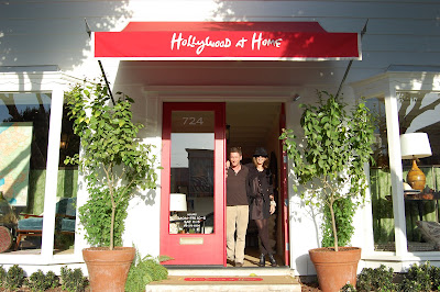
 After Almont Yard, I highly recommend a visit to La Cienega Boulevard. It's chock full of great design shops including interior designer Peter Dunham's chic shop Hollywood at Home. It used to be in Almont Yard so make sure you know that it's moved!
 When you walk in the door and turn to your left, you're automatically transported to Marrakech through Martyn Lawrence-Bullard's fabulous fabrics! The print upholstered on the walls is called Majorelle and the one on the ceiling is actually called Marrakech!
 Sorry this photo is a little dark but I wanted you to be able to see the ceiling.
 Hollywood at Home represents quite a few textile lines including Jed Johnson Home seen above, Carolina Irving, Lisa Fine, Martyn Lawrence-Bullard, and his own Peter Dunham line. That's him posing above.
 Hollywood at Home also sells custom furniture that Peter found hard to find for his design business. They draw on "a blend of Spanish, mid-century Mediterranean, and Anglo-Indian influences."
 I love that most all the LA design shops have wonderful seating areas for meetings and socializing! Also, the How to Marry a Millionaire Rush Side Chair above is one of Peter's most popular and well known designs that is a re-edition of one bought at auction that was seen in the Marilyn Monroe movie. The original is attributed to T.H. Robsjohn-Gibbings.
 Peter Dunham also designed the family home for Juicy Couture co-founder Pamela Skaist-Levy that was featured in Harper's Bazaar magazine.
  I really wish New York showrooms hung their fabrics from grommets and hooks. I love that you can take them down and see them in different light before you request a sample you might not want.
 The front entrance to the shop is this beautiful and flattering pink color. Pink is definitely starting to grow on me! Oh, and the mirror is for sale through Hollywood at Home too!
 While Christian, Andrea and I were hanging out chatting with Peter, Madeline Stuart came in with one of her assistants. As I mentioned previously, Madeline recently moved her office to La Cienega and it's across the street from Hollywood at Home. We joked that she was following us but she really came in to shop for fabrics! A designer's work is never finished!


 Even the bathrooms were chic! The ladies room was papered in a salmon pink grasscloth and the woodwork and shutters were painted to match.
  The mirrored wall extended the tiny space as well!


