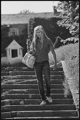
I'm heading down to Soho today to continue my carpet search but where I would really like to be is gallivanting around a pretty garden like Jennifer Garner. I'd also like to wearing the same pretty dresses while the pool boy brings me a glass of lemonade! What's your weekend fantasy???
Ultrasuede: In Search of Halston
I love myself a good fashion documentary and so of course I am dying to see Ultrasuede: In Search of Halston. It is premiering at the Tribeca Film Festival Friday night and you know there will be just as many stars and fashionistas in the crowd as there will be in the film. As Halston once exclaimed, "you're only as good as the people you dress," and he dressed all the best in the 1970's including Bianca Jagger, Liza Minelli, Elizabeth Taylor, and even Jackie Kennedy Onassis! I don't know how he managed to design anything with all the time he spent at Studio 54 but as he also said, "party hard, live hard, and have the best life." Unfortunately, all that hard partying caught up to him and cut short his reign as the Emperor of Style. Luckily, it looks like his legacy will live on in Ultrasuede. Bon Weekend!
Decorating Day
Icons by an Icon
I love how in New York the art isn't always confined to the museums and galleries. Tod’s commissioned the famed photographer Elliott Erwitt to shoot 22 prominent families for its new exhibition called Icons by an Icon. It's also another example of what I like to call stealth marketing. Each photo contains a pair of Tods shoes or a bag but the photos are more about presenting a lifestyle than hitting you over the head with the product which I quite prefer. No word yet if they will be bound into a book like the Italian's photographed for Italian Touch but you can view them at the Tod's boutique on Madison right now. Enjoy!
Photos by Elliott Erwitt for Tod's
Reader Request
I had a reader email me today asking about durable white fabrics that will stand up to dogs. She wants to decorate her home in white with blue accents which made me think of this beautiful home on Nantucket designed by Victoria Hagan. While white looks great, it can be difficult to keep clean in summer homes and those with pets and sticky fingered children so if you absolutely have to have white upholstery, try outdoor fabrics. They are designed to repel stains, water and mildew. This usually makes them feel like sandpaper but Rogers & Goffigan makes a really lovely line of softer feeling outdoor fabrics under their line DeLany & Long. I'm not a fan of slip covers but I do love zip off cushion covers that can be removed for cleaning and advise my clients to order extra sets. If one set is dirty, you can easily zip on a new set. It's also nice to have extra seat cushion covers since they take the most wear and tear on chairs and sofas. Too bad it's not warm enough for Nantucket yet. This house looks very inviting!
Photos by Scott Frances
Picasso in The Metropolitan Museum of Art
I am going to have to hurry up and get all my work done early so I can sneak over to The Metropolitan Museum of Art and take in the new Picasso (1881-1973) exhibition that opens today. This "landmark exhibition"
Cocktails with The New Traditionalists
I recently had the pleasure of being asked to style a bar for a cocktail party celebrating the new collections of The The New Traditionalists. You might know them better by one of their lines Mason Gray or for their children's furniture line Duc Duc. Luckily there were no children at the party last week! Just lots of fabulous friends and designers like Jonathan Rosen, Harry Heissmann, Kevin Isbell, Nick Olsen, Ron Marvin, Bruce Shostak, and Laurie Reynolds who is now working with Bruce!
Since I live uptown and The New Traditionalists showroom is in Soho, I tried to use as many accessories they had on site as possible. This is something that I often so at my client's homes so it actually worked out well.
I owe a big thanks to The New Traditionalists team of David Harris, Rebby Gregg, Phillip Erdoes, and Brady Wilcox for allowing me to be a part of their special night. I can also confirm that a good time was had by all! Cheers!
All of the furniture names are actually numbers that are meaningful to the company. The credenza that I used for my bar/entry table is Credenza No. Two Twenty Five. Not sure if you can tell by the photo but the gray finish was applied over a dark blue finish that can be seen around all the edges. It looked really beautiful in person and perfectly complemented my blue and orange color scheme. You can only see a glimpse of one of their chairs in this photo but you should definitely check out their upholstered pieces. The applied leather trimmings and details are like nothing I've ever seen!
The accessories did include a few pieces from my own apartment including my gold boxes, Eiffel Tower, candle and monogrammed match boxes. I also don't advocate smoking but the multi-colored Nat Sherman cigarettes in the silver cup were a nod to A Single Man and added more color.
While my styling project was like something I would do in a client's home, it couldn't compare with the work of real stylist Frances Bailey! She styled the Armoire No. Five Sixty Four with an orange lacquered interior that I loved! You can have the interiors lacquered any color and it's a fun surprise to find when you open a door or drawer!
I love the Domino magazine quality to the styling of this bar by Frances. I definitely think I need to have her give me some lessons!
Brady Wilcox the Chief Creative Officer of The New Traditionalists styled this simple bar on the Dresser No. Nine. I love how the white lacquer drawer fronts look with the darker wood finish. You can play with the color combinations to your heart's content! The furniture is all made American as well!
Media Room Review
Many of us spent this rainy Sunday watching movies and The Hills marathon on MTV. How much more enjoyable would it have been if Heidi and Spencer weren't so annoying or if we had fabulous media rooms in which to vegetate. In New York, media rooms do double duty as a place to watch TV and house books, like Nate Berkus' apartment above, which is why so many of them incorporate built-ins. Not all of these rooms house a television but their shelves are still inspiring. I especially love the dark lacquered rooms but the light coral/orange room that Katie Ridder designed is pretty darn fabulous! Sitting in a room that pretty would definitely make bad TV seem better! Enjoy!
Subscribe to:
Posts (Atom)