Thank you!

Dear Readers,

I am overwhelmed in a good way by all the kind comments and emails I received yesterday and today.  I want to thank everyone who took the time to write.  I tried to respond to each email but so many came through that I'm afraid I won't get to you all but please know how much your words touched me.

The Kindness post was written with the hope that people would think twice before writing a mean comment or email to anyone, not just me.  As a New Yorker, I like to think I have a thick skin but sometimes there is only so much a person can take.  There are also times when something else might be going on in our lives that doesn't allow us to just ignore a rude comment or person.  I wish more people would remember that before hitting send. 

Thank you again for your wonderful support and encouragement!  Oh, and for the new motto, Illegitimi Non Carborund

XOXO,

Heather

Kindness

I want to thank everyone for their wonderful support and encouragement regarding my upcoming book.  It is really more for you than me and I can’t wait until you can see it.  I also appreciate all the kind words regarding my apartment.  It’s taken a lot of work to get it where it is and will take more work to get it finished but I am really happy in my new space. 

It’s funny how things can change so quickly.  Just a week ago, I had one of those periods that every blogger experiences.  I lost my mojo and was feeling uninspired.  A rude comment from someone berating my grammar didn’t help.  Mind you, he didn’t politely point out my error so I could fix it.  I would have welcomed that help. His comment was on the heels of a nasty email from a reader who was upset that I didn’t post her other comment immediately or take down the photo she demanded be removed because a flag was hung incorrectly.  I guess she didn’t know or care that I was out of the city visiting my family and trying to recharge my batteries by not being on the computer. 

Those can’t top the two accidental replies that I received yesterday in response to my apartment photos.  The subscribers meant to forward the emails to their friends but instead sent their comments to me.  They weren’t terrible but it’s interesting how people who don’t put themselves out there are so quick to judge those who do.  They sit behind their computers and post Anonymous comments or worse, email bloggers directly to tell them how much they don’t like their work.  It’s one of the reasons why I don’t like to post my client work.  I don’t need them seeing something written somewhere that hurts their feelings. 

A top interior designer once told me a story about when he was just starting out at a firm.  In those days, shelter magazines were rare and when Architectural Digest arrived, they all stopped and looked at it together.  While reading one issue, he kept commenting about how ugly everything was and he hated it all.  His boss finally stopped him and said that “someone paid for that design so they like it.  A magazine chose to publish it so they also liked it."  One of things that I have always tried to stress is that “to each his own.”  Just because it’s not your style or you would have done something differently, that doesn’t make it wrong. 

I also don’t pretend to be perfect but I do try to see the good in everything or at least be polite  There have been times that I have thought to myself that something was ugly but I certainly didn’t write an entire blog post about it for all to read.  Why is it necessary to be so unkind to strangers online? 

Just as I kept wondering why I continue to blog for people who don’t even appreciate it, I received an email from a friend.  She was in Paris and couldn’t wait to check out the hotel that I just posted.  She also informed me that she was moving out of New York because she was just diagnosed with ALS or Lou Gehrig’s disease.  That put everything in perspective.  There are a lot more important things in this world that we should be worrying about than whether I misspelled a word or you didn’t like someone’s room. 

She also said, “Your blog makes me happy so keep it up.”  It was always my intention to make Habitually Chic a happy place where you could come to see something pretty or learn something new.  Maybe have a laugh and be inspired as well.  There is nothing I can do for my friend to help her condition but if reading my blog everyday will bring her some sense of happiness during her struggle, then I will definitely continue. 

Her last line read, “Life is short, live everyday to the fullest!”  And to that I add the immortal words of Plato, “Be kind, for everyone you meet is fighting a hard battle.”  

By Invitation

A few readers asked me about my bulletin board so I thought I would take a minute to explain.  It is actually an old one that came from my childhood bedroom.  I covered it in batting and then attached fabric with a staple gun.  When a board has ribbons, it's usually referred to as an "invitation board" since you would tuck invitations under the ribbon.  I crossed strips of ribbon and stapled them behind before using small upholstery tacks to keep them down on the front.  I don't like making holes in my postcards and pictures so I prefer this method.  The best part is that if you redecorate, you can just change out the fabric or switch out the ribbon for another color.  Pottery Barn makes two sizes of bulletin boards that look great as they are or you could also add the ribbon and tacks.  Good luck!

New Apartment Pics

It's been challenging to say the least to work on decorating my apartment while keeping up with all my other work projects.  That's definitely why only one side is finished or maybe I should say mostly finished.  I am sure I will make more changes and move things around as I continue around the room.

I am so happy that I purchased the John Widdicomb dresser or commode depending on how fancy you want to sound. I love that the word commode comes from the French word for "convenient" and the drawers on this piece are very convenient.  I like having place for your eye to rest when hanging art which is why there is a bare spot above the lamp but that might change as I add more artwork to my collection.

I also tried to make the television blend into the art installation so it is less prominent. The piece in the black frame might be swapped out after I get another piece of art in my collection framed.

I bought this painting from Belgium on eBay and it is one of my favorites. The little brown leather box with the gold embossed lion contains two sets of playing cards from Piatnik and were made in Austria.  I'm going to have to pull them out and photograph them because the face cards feature royalty including Marie Antoinette, Louis XIV, Maria Theresia, and even Count Axel von Fersen.

Kelly Wearstler's book Hue is also a favorite.

I couldn't think of a better place to hang my Marie Antoinette etching than above my favorite blue chair.  Technically it's from Belgium (via Jayson Home & Garden) but looks French enough.  There seemed to be too much space between the chair and picture so I hung one of my new red Willow plates that I bought while visiting home recently.

As I mentioned, the drawers in the John Widdicomb dresser are very convenient and the second drawer now holds all my stationery, paper products, and ribbon.

I tried using this chair at my desk but it's a bit fragile which is fine.  I think it's more fun to look at it than sit on it anyway.

In my move, I finally found my calligraphy pen and ink.  I also can't wait to use my new orange Smythson notebook that was a lovely gift from the company. 

The bench fits perfectly in front of the bookshelves as I knew it would when I picked it up at the flea market this weekend.

I bought this little painting on eBay as well and wish I could find the artist again.  I just love looking at it.  I just read an article that mentioned scientific research that concluded that "looking at art induces the same feelings of pleasure as being in love."

My bookshelves again.  I'm waiting for a pair for the other side of the room so I can finally unpack the rest of my books.

My prized pile of old Domino magazines.  Yes, I have doubles of some issues and no, you can't have them.

There is a funny story about this painting of a house on the other side of the room.  My parents own this same painting and when I asked if I could have it, they said no.  But my mother commissioned the artist to paint me my own version.  As an only child, this means I will have two of the exact same painting someday which always makes me laugh.

I bought the painting on the left also on eBay for probably not more than $30.  It reminds me of Van Gogh and also makes me happy when I look at it, or maybe it's love if that recent research is to be believed.  The back has a stamp from the Thompson Art Gallery c/o Thompson & Basile, 20 Cornelia St. NYC. It also has tape on it from the Tribune Subway Gallery with the phone number Wisconsin 7-4899.  Very old school and dates the painting to around the mid 1940's.  The other is just a post card in a vintage frame.

I love the sound of my Bose iPod dock.

More books.

My current inspiration board near my desk.  I need to work on that area next and have the skirt made.

I think the chicest thing you could buy for yourself or as a gift are monogrammed matchboxes from ForYourParty.  I love giving them out at events and using them in my apartment. The absolute best thing about my new apartment though is the south facing front windows.  They certainly make up for the one that faces the brick wall in the microscopic kitchen. 

Photos by Heather Clawson for Habitually Chic

Blass Act

Since I mentioned fashion designer Bill Blass in my last post, I thought his One Sutton Place apartment deserved a little love.  I've found a lot more photos of the elegant apartment since I first wrote about it in 2008.  I still love his quote about interior design, "I have always thought that fashion designers are the best interior designers. I love it. It's all a question of the eye; you are soliciting the same innate talent."

"There is nothing feminine about that apartment on Sutton Place or the Connecticut house.  There's nothing feminine about the way he entertains.  The flowers are not feminine.  There's just a bunch of one of a kind." - Mica Ertugun

"There's no question that I find houses and decorating absolutely fascinating.  That really turns me on. That's when I get excited." - Bill Blass

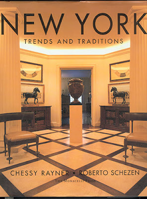
Blass worked on the One Sutton Place apartment with Chessy Rayner and Mica Ertugun of the interior design firm MAC II.

As any apartment does, it went through changes over the years and his famous Picasso drawing replaced a map over the fireplace.

I might have to go back to The Metropolitan Museum of Art to see if left them this head.

"There is a sense of dignity, a simplicity and a classicism in my clothes which can be read into the apartment. As I am surrounded with colours and fabric all day I look forward to a monochromatic home. I work in fashion - I don't want to live somewhere that looks fashionable." - Bill Blass

"I moved in solely because of the height of the ceilings and the size of the rooms, and because they were square. I mean, square is the perfect shape for a room." - Bill Blass
"I absolutely believe in Pauline de Rothchild's theory that lamps are the most jarring note in almost any home.  She only brought them out at night when they were needed.  Otherwise, they were to be banished, like the Hoover sweeper." - Bill Blass

"What I have here is the result of a lifetime of collecting. There is no relationship between the things themselves - except that I like them. You know how American women choose to wear a dress and invest it with their own spirit: I admire that sort of philosophy, and when I collect things, I choose how they are going to look in my life. The way I decorated here was to surround myself with the things I love...and they all have great dignity. And although I choose all the furniture and pictures, I did, as a bachelor, seek out a woman to put it all together...I had the advice of Chessy Rayner." - Bill Blass


Drawing of Bill Blass bedroom by Jeremiah Goodman

Magnificent Met Museum

In order to start photographing my book, I first had to upgrade my camera.  After appealing to the powers that be at Canon for a discount, to no avail, I plunked down a boatload of money for the Canon EOS 5D Mark II.  As I joked on Twitter, learning to use this camera was like trying to drive a Ferrari after only having ridden a Vespa.  I decided that a great place to practice and escape the heat would be The Metropolitan Museum of Art.  The Greek and Roman Galleries are my absolute favorite places to visit and were my first stop.  I was inspired to shoot in black and white by the hauntingly beautiful photos of statues in Florence and The Louvre by Christopher Draghi. What always strikes me is how alive the statues still look to this day.  I really had the feeling that some of them were going to all of the sudden start speaking to me.  These galleries are really magical and magnificent but with help from Bill Blass, see last photo, I would expect nothing less.


Photos by Heather Clawson for Habitually Chic