 I think it's important to remember that Showhouses aren't always reality. Sometimes the rooms are a little over the top or just might not appeal to everyone. As I've mentioned before, I think it's important to keep an open mind. There is usually some aspect of a room that you can take away or be inspired by even if you don't like the entire room. Just because it's not your style, doesn't make it wrong.
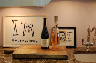
 The Living Room is the Hampton Designer Showhouse was designed by Robert Stilin who also designed the House Beautiful Kitchen of the Year with Ina Garten. My friends and I really liked this room in person. The walls are a pale lavender which sets of the modern and contemporary art. It also has a small kitchenette attached so to me it had the look of a very chic city apartment for an art collector and was also very soothing and relaxing. I also didn't even notice until I looked at the photos that they hung the art over the paneling. I know this might not appeal to everyone but I have to say that it worked in person. It was a bit of a masculine room but it could be reworked for a woman by lightening up the upholstery fabrics. It's also important to keep in mind that many people live in the Hamptons year round so they might not want a beachy feeling home but one that reflects how they also live in the city and that's how this room feels to me. To each his own.
Photos by Heather Clawson


